Review: EM at Pace
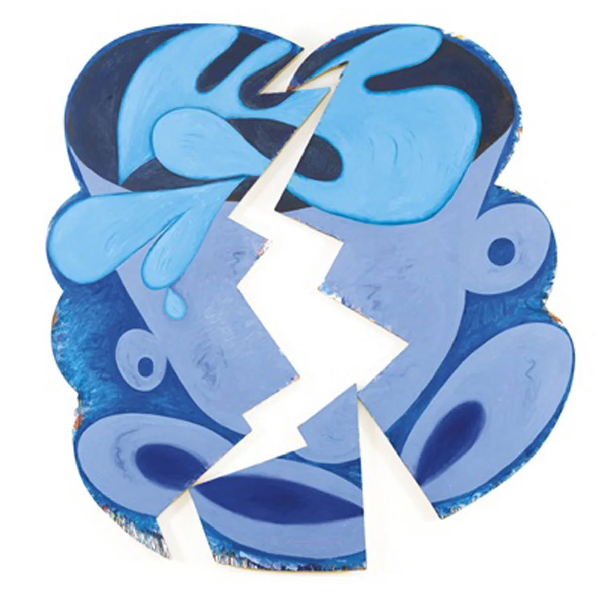
Elizabeth Murray, "Wake Up," 1981, OIl on canvas (three parts), 111-1/8 x 105-5/8 x 3-3/4 in. (281.94 x 267.97 x 9.5 cm). Collection of the Murray-Holman Family Trust, New York
ArtForum (March 2018)
Elizabeth Murray
PACE
by Barry Schwabsky
An unexpected, utterly unstable synthesis Chicago's unruly, almost lowbrow Imagism with the more calculated approach—and blockbuster scale of New York abstraction: That’s what Elizabeth Murray achieved at her best. The twenty-five works in “Elizabeth Murray: Painting in the ‘80s” made it absolutely clear why she became one of the leading American paintings of that decade, even though her work—no more neo-expressionist than neo-geo—didn’t really fit in which anything else going on. The frenetic energy of these painting is simply undeniable, and it’s the energy of a formidable but unruly intelligence in action. At the time, one had the impression that she was massively influential, yet she was such an oddball that no one really seemed to know how to be influenced by her.
On one of my visits to the show I happened to run into the poet Bob Holman, Murray’s widower. He said something in passing that struck with me, “Elizabeth always wanted to create her own frame,” by which I understand something like William Blake’s impulse to forge a system so as not to be trapped in another’s. But I also hear in Holman’s remark something more specific: Murray’s desire to create a form of painting so dynamic that it cant’ be contained by anything but its own edges. The exhibition charted the most tumultuous period in Murray’s search for a self-defining pictorial construction. It took off with a couple of not-very-still life paintings, both from 1981. The aptly titled Wake Up is a three-part work in predominantly blue and turquoise: A cup is rocking wildly in its saucer, the fluid in it splashing over, and its energy seems to have broken the image apart into jagged-edged fragments, leaving a central lightning bolt of white wall; Just in Time, in two parts, features softer, voluptuously curved forms with an ascending energy rather than the centrifugal on of Wake Up, but is coloristically jazzier than its companion. In works from 1982 through mid-decade, Murray experimented with overlapping as well as juxtaposing her painted planes; the underlying imagery comes less legible, though a figurative, even narrative impulse persists. I wouldn’t easily have recognized the table in Table Turning, 1982-83, without the clue given by the title; and without seeing that green form as a piece of furniture, neither would I have noticed that there was yet another of Murray’s cups sitting atop it—so freely did she transform (“turn”) every image that entered her painting according to the needs of her metamorphic pictorial imagination.
In the second half of the decade, that passion for transformation pushed Murray toward a more radical revision: No longer was the plane one of her presuppositions. Suddenly the surface could be understood as perpetually curving; front and back could change places, as at the top corners of Making It Up, 1986, which seems to billow like a sheet in the wind, while in works such as Stay Awake, 1989, and Dis Pair, 1989-90, surfaces fold over themselves to become three-dimensional bodies with opening to unseen interiors. These painting make you want to fall in, like Alice down the rabbit hole.
For Murray, the great challenge in the later 1980s must have been to prevent her work’s newfound sculptural dimension from dominating its pictorial aspect—to avoid having its imagery constrained by its form, instead allowing them a complex interplay. In that, she succeeded completely. She worked more freely across her awkward, eccentric shapes than most other painters can with a flat rectangle. True, the paint itself was sometimes overworked, but more often hit a sweet spot between plush density and a more workmanlike ruggedness. It’s particularly interesting to notice the edges where the color things out and its underlayer reveal themselves. You’d call Cracked Question, 1987, a grisaille if its edges didn’t reveal the shades of gray and black to contain a multitude of other hues. Murray was a spendthrift in that way, and not only with color—she didn’t need to use everything she used, if you see what I mean. Her exuberant paintings contain more than most of us my ever know.
—Barry Schwabsky